


Why this article
I wanted an exhaustive list (to be updated in future with updates) of SharePoint List or Microsoft List Column Formatting options, examples from this GitHub page.
It allows to format a SharePoint Online or SharePoint 2019 list or document library using some JSON code.
For SharePoint 2019, there are limitation and few things to know.
Tools
Chris Kent has released a great tool as SPFX webpart helping designing your column formatting, make sure you check it out.
There is also this tool to convert HTML to JSON, by PnP community (source)
How to use this page ?
Click on each header, to access the detailed page about how to achieve each formatting.
Question you might have and support
For any question, support, I recommand you open an issue on github.
And please refer to Column formatting documentation (by Microsoft)
More info
I update this article manually, so more column formatting may be available on the github page.
Last update : 18/03/2023
Enjoy 😁
Sample & Features by Microsoft
- Get started with column formatting
- Display field values (basic)
- Apply conditional formatting
- Conditional formatting based on a number range (basic)
- Conditional formatting based on the value in a text or choice field (advanced)
- Apply formatting based on date ranges
- Create clickable actions
- Create simple data visualizations
- Format a number column as a data bar (advanced)
- Show trending up/trending down icons (advanced)
- Formatting multi-value fields
- Basic text formatting
- Simple HTML elements formatting
- Complex HTML elements formatting
Display Comment Count
This sample adds a visual indicator to a list item, showing the number of comments present on it

Page-a-day Calendar
This sample customizes a date column to look like a page-a-day calendar

View
Inline Column Chart
This sample demonstrates displaying a column chart using SVG.

Overdue date

Turn field values into hyperlinks

Project Indicator Formats

Project Register where ‘Current Status’ column is formatted based on the RYAG status.

Conditional formatting based on a number range – Minimum Value Highlight

Format a number column as a data bar – Data bar


Show trending up/trending down icons

Conditional Text Formatting (Severity)

Traffic Light (Red-Yellow-Green) Status Indicator

Formatting Yes/No field to check mark based on the value in the field
You can apply conditional formatting to Yes/No fields. This sample applies different classes depending on whether the value of the field is Yes (true), No (false), or Blank.
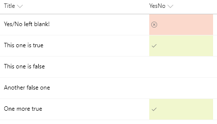
Yes/No Column Check Mark
This example displays a check mark when the value of a Yes/No column is equal to Yes.

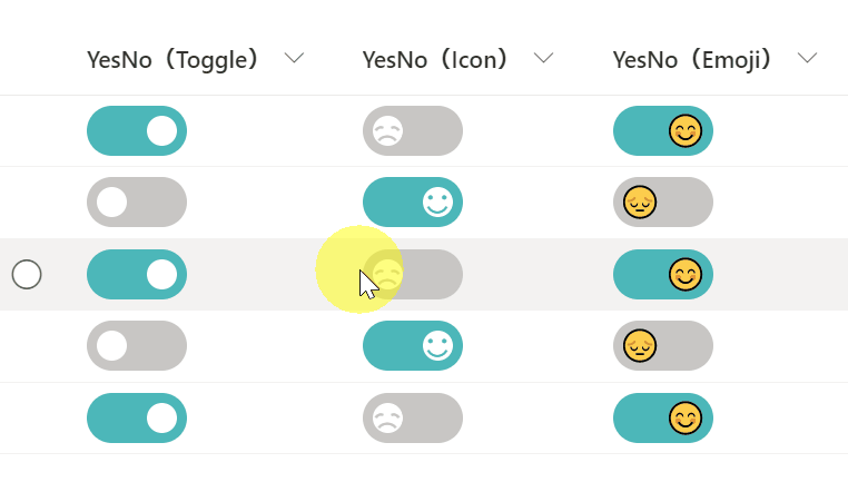
Yes/No Column Toggle
Demonstrates changing the value of the Yes/No column to a toggle. Three different versions of the sample are provided (Toggle, Icon, & Emoji). Also, this sample uses the setValue of customRowAction to update the field. You need to set the actionInput to the internal name of the column to be updated.
Yes/No Checkbox
This sample uses Office UI Fabric icons and theme classes to provide a better visualization for Yes/No fields while respecting theme colors.

Concatenate Currency Symbol to Numeric Columns

Displays a customizable Google map image for a given location
This template takes advantage of Google Maps’ staticmap API which generates an image using a parameterized URL.

Display Twitter profile pics using Twitter handles
Using just the Twitter handle, Twitter profile pictures are displayed in a circle and clicking them will open the user’s Twitter page in a new window. The handle is also displayed as a tooltip when hovering over the profile image.

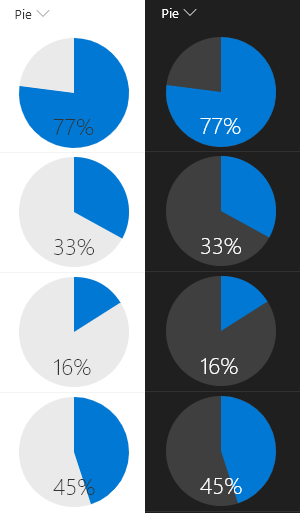
Formatting percentage number (%) to pie chart.
This example renders whole pie in neutralLight with radius 50 and the number% (column value) as a slice of the pie in blue using <svg> with <path> tags. The number% displayed at the bottom of the pie in neutralPrimary.
Highlight the current user
This sample uses the @me keyword to check if the person field is the current user and shows that person using a different color and weight

Display a picture column as a circle

Display a person’s profile picture in a circle

Launch a flow on selected item – Launch a Power Automate
Use column formatting to create buttons that, when clicked, run Flows on the corresponding list item. The Flow Launch Panel will be displayed after clicking the button allowing the user to specify any required data and then run the flow.

Show a power automate status in a list – Flow Status
This sample conditionally shows a button to launch a flow. Additional details are provided to customize the flow panel title and button. This provides context to users and is often far more meaningful than the default of “Run Flow” which generally doesn’t mean much to end users
Launch Power App Button
Providing a direct link to an item within Power Apps is easy to do using this sample. To use it follow the instructions below to get the link to your Power App (and replace that portion of the format).

SVG icons
This sample uses the value of the current field to show a custom icon and color.

Smiley faces – Quiz Results with Emoji
Allows teachers to show smiley faces next to quiz results similar to how they do it on paper.

ISBN to Book Cover Image.
This example retrieves book cover images based on their ISBN numbers by utilizing the Open Library Covers API. The API works by building a cover image URL with the ISBN.

Multi-line Text with Word Wrap
With modern document libraries and lists, lengthy multi-line fields no longer show text in full (a fade is provided). This isn’t always desired, so this sample demonstrates rending long text to mutilple lines with word wrap, similar to classic mode.

Strikethrough on Completion
Classic task lists add a strikethrough style to the task name when the task is marked as completed

Twitter Profile Pics
Using just the Twitter handle, Twitter profile pictures are displayed in a circle and clicking them will open the user’s Twitter page in a new window. The handle is also displayed as a tooltip when hovering over the profile image.

Social Media Profile Pics
Using the social media handles supported by https://unavatar.now.sh, social media profile pictures are displayed in a circle and clicking them will open the user’s social media page in a new window. The handle is also displayed as a tooltip when hovering over the profile image.

Convert File Thumbnails or Hyperlinks to image
This example uses a column to generate a hyperlink to the Item Thumbnail for a document library.
Before

After

Centered Content (center text in sharepoint text column)
This is a basic sample that demonstrates making your content be both vertically and horizontally centered (in the middle) within the cell.

Creating Red-Amber-Green (RAG) bars based on date ranges
This example creates colored data bars on the current field based on DueDate and StartDate fields compared to the current date/time. The bar fills towards 100% as “Today” approaches the due date. A percentage width is determined based on the total number of days between the StartDate of the item and the DueDate of the item.

Concatenate Currency Symbol to Numeric Columns
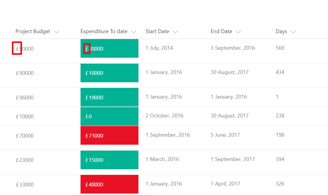
Project Register where ‘Project Budget’ column is compared with the ‘Expenditure To Date’ column and formated based on the condition with Red or Green color. Please note that both columns must be a number type for this to work.
Linking to a local resource
This sample provides multiple formats to illustrate the options available to link to local resources. The primary purpose is to demonstrate the usage of @currentWeb (O365 only) to prevent issues with reusable formats or formats rendered outside of the main list view. This format links to other lists, but this could just as easily be specific pages/files/etc. on a site.

Row Actions (Launch a power automate, user friendly action)
You can use column and view formatting to create buttons that perform pre-defined actions when clicked. This sample provides a quick format that demonstrates the use of each of the possible actions.

Conditionally Launch Flow for Item
You can use column formatting to create buttons that, when clicked, run Flows on the corresponding list item. The Flow Launch Panel will be displayed after clicking the button allowing the user to specify any required data and then run the flow. This is demonstrated in the Generic-Start-Flow sample.
This sample demonstrates how to take it further to conditionally change which flow is launched or if a flow button option should be shown at all.

Multi-Choice forEach
This sample demonstrates usage of the forEach property to create template elements applied to each choice in a multi-select choice field.

Multi-Choice Icons
This sample demonstrates using the indexOf and join functions (O365 only) to test if a multi-select choice field has a selected choice.
Multi-Person Facepile
This sample provides rounded images for each person in a multi-select person field.

Multi-Choice link
This sample shows how we can display multiple links in a single column using the multi-choice column.
Note: If rich text column is used to display links then this sample can be ignored.
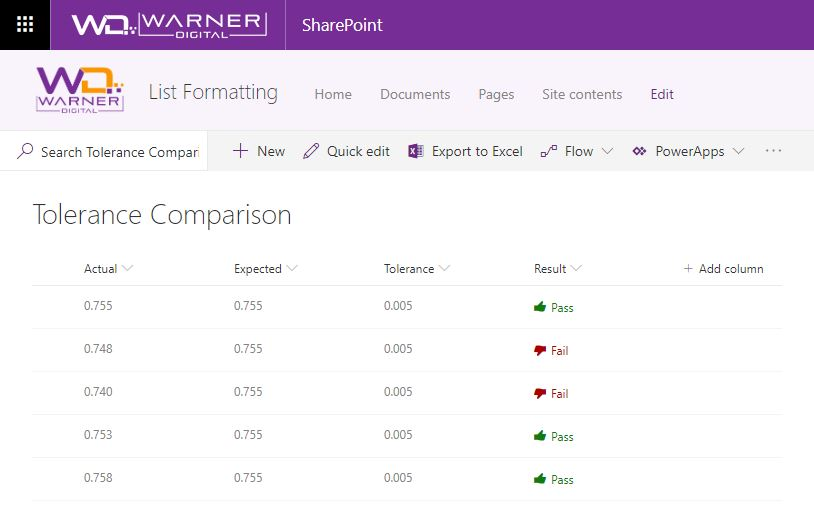
Display if a value is within the expected tolerance.
Icon Progress Bar
This sample demonstrates creating a progress bar using icons. The number column represents the stage in a process and the format provides a visual indicator of where an item is in relation to the process by showing the previous steps as completed, highlighting the current step, and indicating which steps remain.
Display a Bing Maps Image for a Location
This template uses Bing Maps’ staticmap API which generates an image using a parameterized URL.
Text Contains
This sample test if text contains a given value.

Text StartsWith Calling Codes
Test if text starts with a given value. Using the international calling code at the start of a phone number, the correct country’s flag is shown next to the phone number.

File Thumbnails
Create an inline preview for document libraries. Folders and filetypes where previews are not available will not display at all.

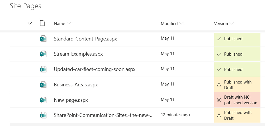
Publishing Status
Sample contains an example of using the modulo math expression for highlighting ‘published’, ‘published with draft’ and ‘draft with no published versions’ of pages
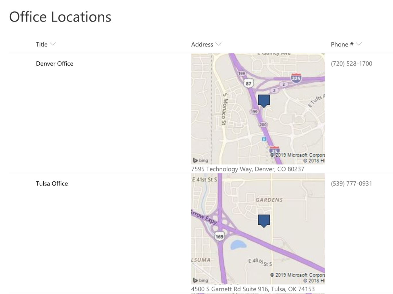
Display Location Address Details
Location columns provide several properties that can be accessed to provide more information to users. This sample pulls out sub properties to turn the standard Display Name only to a full address and provides a link to Bing Maps for a given location.

Multi-Person Teams Chat Link
This sample demonstrates creating a deep link to a Microsoft Teams chat. This format works both within Microsoft Teams and within SharePoint Online.

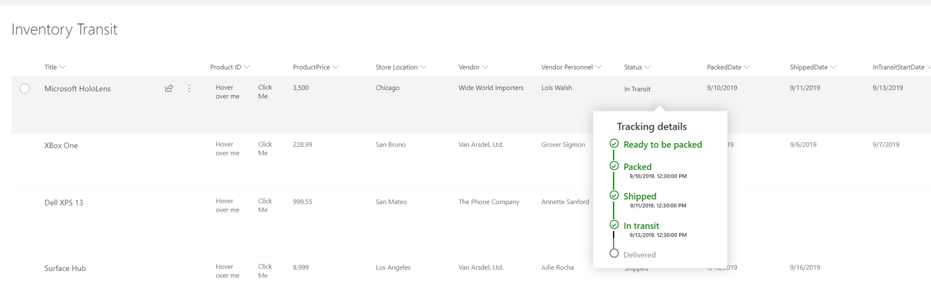
Custom hover card column on Lists
The following image shows a list with a custom hover added to a List
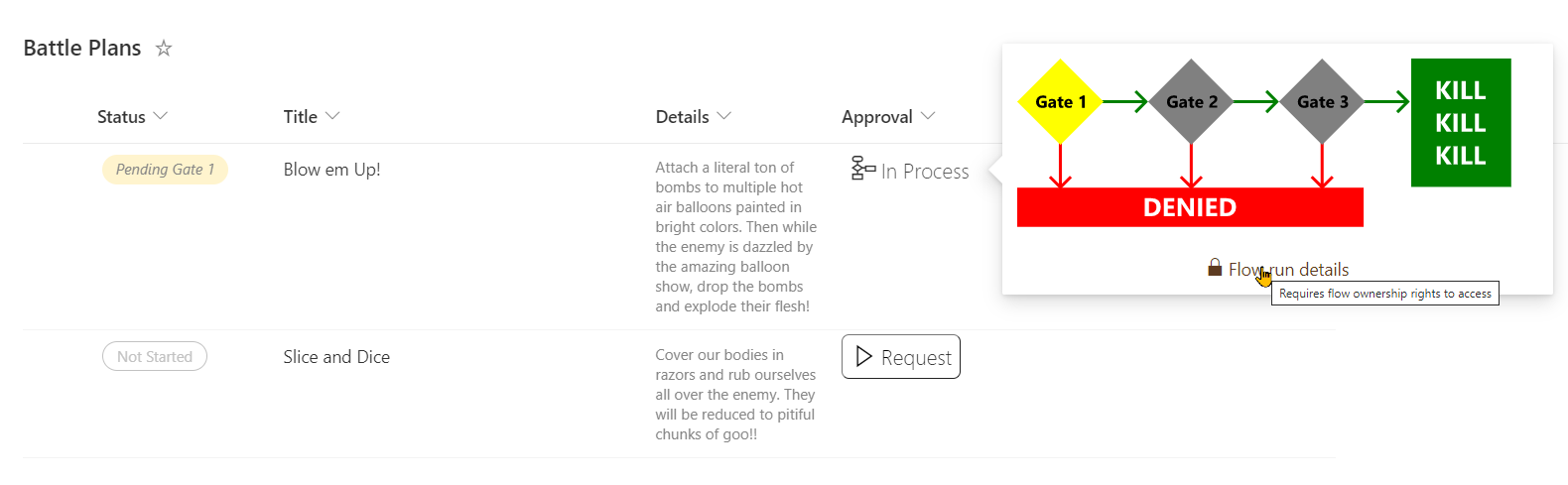
Approval Status Hover Card (Power Automate Status Progress)
This sample provides more detail on list/library items when the standard Conent Approval flow is enabled. The approval status and a related icon/color are shown with additional details about the overall process visible in a panel on hover.

Date Difference
This sample demonstrates calculating the difference between 2 dates.

Icon Overlays
This sample demonstrates using a solid icon based on choice column
Number Gauge
This sample demonstrates combining a fixed SVG (gauge background) with a dynamic SVG (needle). It makes understanding number columns (percent) very intuitive.

Formatting a column when a date column is blank

Work Progress Category Pill
Based on a choice column

File Preview
This sample opens Microsoft Office documents in full screen within a new tab. This is the same view as used in the fileviewer webpart (no toolbars).

Person hover card on Lists
On hover, on a formatted person column : a profile card is displayed
Person Mail To Link
Mailto on a person name (link configured by you in json), it’ll open Outlook New Email Window
Mail To Button
Demonstrates making a mailto link (opens email with prepopulated values) button that references a different field.


Doughnut Chart
This sample changes the appearance of the values in number columns (percent) to a donut chart. The donut chart is displayed using svg.

Number Battery
This sample changes the appearance of the values in number columns (percent) to look like a battery.

Multi-lookup fields and projected fields
For lookup column, maybe you don’t want out of the box link and formatting, this improve the formatting :

Managed Metadata Tag Icon
This sample displays a tag icon to the left of the value in the managed metadata column.
Display Location Weather Details
This sample utilizes sub properties of a Location column to build an image src that pulls weather from WeatherForYou.com.

Image Lightbox
This sample demonstrates showing the full size image in a lightbox (hover card) rather than opening this image in a new window.

YouTube Thumbnail
This sample provides a thumbnail of a YouTube video that links to the video and a larger preview image on hover.
Yearly Gantt Chart
This sample demonstrates the display of a yearly Gantt chart.

Timeline Format
This sample demonstrates displaying a timeline in a column. If the column value is empty, no circle will be displayed. The content of the column will be shown in a popup when you click on the dot.

Time Schedule
This sample demonstrates a time schedule with a filled background from Start time to End time.

Linking to the scheduling dialog in Microsoft Teams and Microsoft Outlook
This sample demonstrates creating deep links to the scheduling dialog in Microsoft Teams and Microsoft Outlook. Display a list of training and their link to teams meetings


Display count-up and count-down buttons
This sample demonstrates a button with a number increasing by one and a button with a number decreasing by one. Also, this sample uses the setValue of customRowAction to update the field. You need to set the actionInput to the internal name of the column to be updated.

Number Circle in Circle
This sample shows how the percentage value in a column can be displayed as the area of a circle within another circle.

Background color shading by number column value
This sample demonstrates how to change the shade of the background color depending on the value of the number column. Also, in this sample, the background color is lightest at -100 and darkest at 350.
number-background-color-shading-theme-color.jsonuses your site’s theme color as the background color.number-background-color-shading-custom-color.jsonuses the HTML color code as the background color, and in the sample,#FFBBFFis set.

Reacting and displaying users who have reacted
This sample demonstrates how to react and display users who have reacted. If the current user reacts, the number will be bolded. Also, this sample uses the setValue of customRowAction to update the field. You need to set the actionInput to the internal name of the column to be updated.

Display users who have liked
This sample demonstrates showing the users who have liked an item.

Monthly Emoji
This sample demonstrates how to display a emoji representing the month of the date to the left of the date.

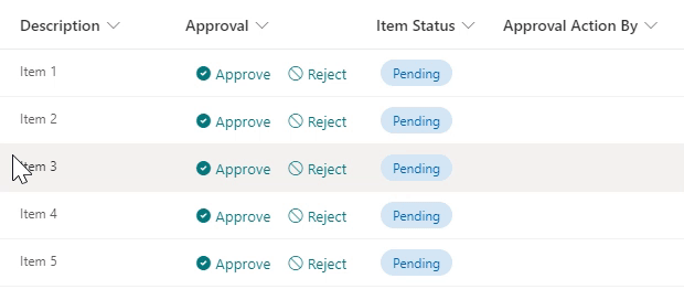
This is a sample of creating buttons to approve/reject an item by updating an Approval Status field created using a choice field, and also set the value of a person field to the user who took the action by using the setValue action as below:
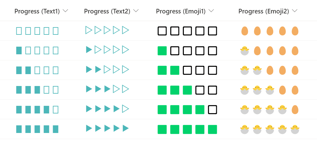
Progress bar using text or emoji
This sample demonstrates how to display a progress bar by repeating text or emoji using the padStart operator.
Number Localization
This sample demonstrates changing text output based on the @lcid token. This allows you to provide localized text within your format ensuring that users in various regions can use your formats without issue.

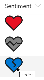
Heart in Heart
This sample demonstrates how to change the size of a heart by using the percent value of a numeric column.
number-heart-in-heart-site-theme-color.jsonuses the theme color of the site as the color of the heart.number-heart-in-heart-custom-color.jsonuses the HTML color code as the the color of the heart, and in the sample,#FF0000is set.

Count the number of clicks on a link
This sample demonstrates counting the number of clicks on a link. By keeping track of the number of link clicks, you can figure out which links are popular with users.

Flow Status

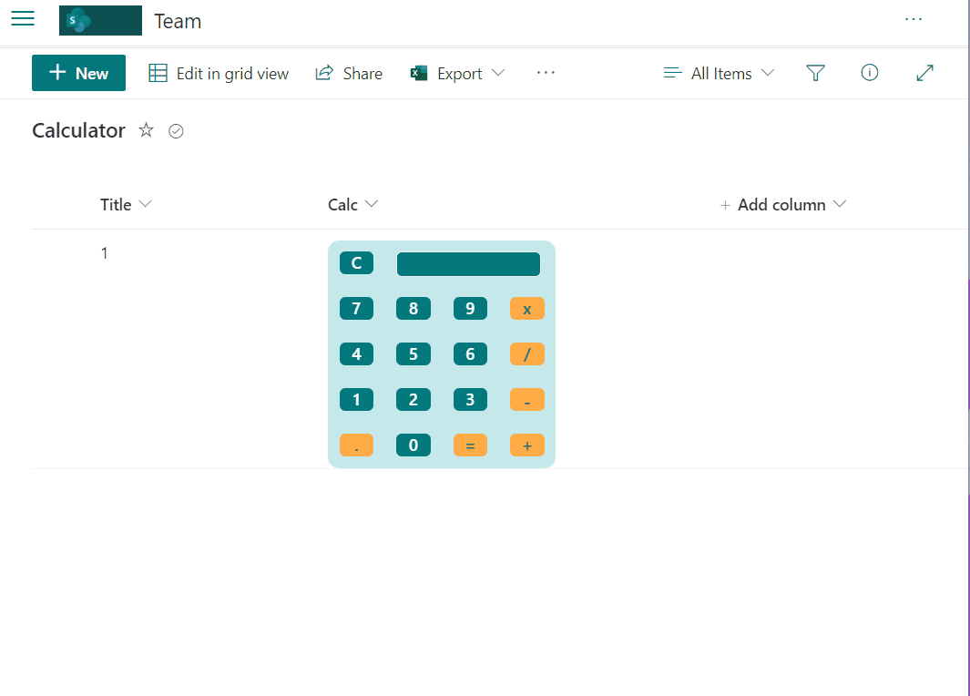
Calculator sample
This sample includes design capabilities and formulas to simulate a simple calculator.
Date update format
This sample includes format to manage date in view column with follow options, include icon option to add today’s date, add or reduce by day or year and icon to clear date.
Wrap up
Again those samples are not done by me and are all available on github.
Which one are you using ? Which one you wish to see as Column formatting ?
Jeff was very helpful with giving me ideas and solutions (that I modified to fit my own needs) in solving an issue with a SharePoint list. He was very responsive to my questions and asked good questions in return to better understand what I was trying to accomplish. He was very helpful, as is his web site Office 365 Notes.
You are more than welcome 🙂 Do not hesitate to share which topic you would like to see covered
This works fine. Only issue is if you have a calculated date column in the same library as the column you add formatting to the date format switches to the JSON Data and time and looks terrible, not sure if this is a feature or a bug?! Using JSON in any column sets JSON for all columns even if not code entered so some calculated columns get odd outputs. just to be aware of this.
Thanks for your feedback, i’ve not tested that case unfortunately so it is good to know !
[…] the article – Column Formatting options let’s have the same exercice for this feature View Formatting announced during SharePoint […]
The link for “Add an action button to a field” is dead. The sample on GitHub is https://github.com/SharePoint/sp-dev-list-formatting/tree/master/column-samples/person-mailto.
Thank you a lot 🙂 It has been updated. Which one did you implement ?
@jeffangama, I “tweaked” the mailto sample to just show icons for some internal links based on other column data (e.g., $Alias, $Role). In the process had “them” correct the source page on MS docs (https://docs.microsoft.com/en-us/sharepoint/dev/declarative-customization/column-formatting#add-an-action-button-to-a-field-advanced). The class for clickable actions (sp-field-quickActions) was missing the trailing “s”, so using the code “as-is” (pre-fix) would not render the icons in an a/href at all. Depending on my team’s needs, desire for pretty pictures, etc. we may incorporate other actions, etc. but still in look-see mode.
Is there a way to format column based on duplicate values. I have a view that uses a Group By based on a column. What could be a best option to find the count and apply a a background color if count of group by is greater than 1.
Hi, sorry i’m not an expert in that field, please ask the community here : https://github.com/pnp/sp-dev-list-formatting/issues
I must be missing something. Where can I find the actual code for these? There are some I want to use
HI, click the title of each capabilities 🙂
Perfect Thank you
Is it possible to build something with ICONS (let’s traffic lights) and comments (Free Text and might be different) together in 1 column?
Hi Jeff, Thanks for this awesome site.
I was wondering if it’s possible to hide the date field if [$title] = ‘No items’ using (if else) in the below json code under format current SharePoint list view or do I need to write a SharePoint extension for this requirement.
json Code below – formats the title and date field.
{
“schema”: “https://developer.microsoft.com/json-schemas/sp/view-formatting.schema.json”,
“hideSelection”: true,
“hideColumnHeader”: true,
“rowFormatter”: {
“elmType”: “div”,
“style”: {
“font-color”: “#dcdcdc”,
“font-family”: “arail”,
“font-size”: “10pt”,
“max-width”: “900px”
},
“attributes”: {
“class”: “ms-bgColor-white”
},
“children”: [
{
“elmType”: “a”,
“txtContent”: “=@currentField”,
“style”: {
“flex-grow”: “1”,
“display”: “flex”,
“flex-direction”: “row”
},
“attributes”: {
“target”: “_blank”,
“href”: “[$URL]”,
“class”: “ms-spGrid-HeaderContentStyle”
}
},
{
“elmType”: “div”,
“style”: {
“flex-direction”: “row”,
“font-size”: “10px”
},
“attributes”: {
“class”: “sp-row-listPadding”
},
“txtContent”: “=’SomeText:’ + ‘ ‘ + toLocaleDateString[$date]”
}
]
}
}
Hi, glad you find this page useful. Sorry I’m not an expert in json (yet :D), you might ask the question here : https://github.com/pnp/sp-dev-list-formatting/issues
This page is awesome and I have used it multiple times. I wonder if you could cover a request that we have. We work in a global team, we capture the timezone that a person is in but it would be great to show what time it is where this person is based with a clock (analog or digital). Do you think this would be possible?
Hello, thank you for the kind words.
For your requirement i would create a powerapps displayed in a sharepoint page. Column formatting cant be that intelligent.