


Why this article ?
Following the article – Column Formatting options let’s have the same exercise for this feature View Formatting announced during SharePoint Conference 2018.
I wanted an exhaustive list of formatting options for Views, in order to answer employees needs.
Where are the sample from ?
This is a summary of the GitHub repository to format Microsoft List Views in SharePoint or to format Microsoft List in Microsoft Teams.
Below the list as per 07 / 09 / 2023, click the title to see how to implement it.
How it works ?
It turns lists view into a more visual list of items, articles, anything you’d like.
How it works ? How to set it up ? Click the link on each title to access the detailed page.
Exemple : From

To : Bulletin board
Keyword : Newsletter

Employee Onboarding: Steps
This sample is intended to be used in combination with the Employee Onboarding list template. The format restores the intended alternating rows but also adds a Tiles view that provides a more step based approach.

Issue Tracker: Planner Cards
This sample is intended to be used in combination with the Issue Tracker list template. The format keeps the row highlighting for blocked issues but also adds a Tiles view that provides a Microsoft Planner look and feel.

Message Chat Bubbles
This sample formats your SharePoint list view to look like message chat bubbles! If the Author is the current user, the message will be displayed on the right.

Project Gantt Chart View (🌟 My favorite)
This project Gantt Chart sample demonstrates how to show a list of high-level tasks in a Gantt chart. It is mainly useful for top-level views.
So this

Turns into this

London Underground Line Status
Display on the homepage of your SharePoint intranet a continually updated feed of London Underground line statuses using the publicly available Transport for London (TFL) API.
The results are retrieved using Power Automate, then written to a SharePoint list, and the list view is styled (using view formatting) so it looks like the familiar TFL tube status board with correct line colours. Any line not currently in Good service can be clicked and a hovercard will show with further information i.e. delays/suspension/closure etc.


Technologies Used
- SharePoint
- List (used to store the latest TFL line status data)
- View Formatting (JSON used to style the list into the familiar TFL Status board)
- List (used to store the latest TFL line status data)
- Power Automate (used for both creating the Tube Status SharePoint list using the SharePoint REST API and then, on a scheduled basis, retrieving the latest TFL tube statuses)
- Azure Logic Apps (OPTIONAL – used for retrieving the latest TFL tube statuses using Azure Logic Apps instead of Power Automate.)
Prerequisites
- You must be licenced and able to create Power Automate flows
- If Azure Logic Apps option is chosen you must be able to create or have a Logic app created for you.
- You must have a valid SharePoint Online license and permission to create lists.
- You must have a modern SharePoint site where you can store the data for the app.
- Download the assets from this folder
Linkinbio
This sample creates a link in bio card for users. A “Link in bio” is important for people to have because it provides a centralized location where they can direct their followers or potential customers to access more information about them, their products, or their services.

Timeline Format
This sample formats your SharePoint list view to look like a timeline

Contact Cards
This is a sample of a complex format that customizes the entire display of a row. The goal is to illustrate several key principals including:
- Responsive layout through flexbox
- Conditionally showing elements based on fields having values
- Providing placeholders when fields are blank
- Row Actions
- Opening the information panel (
defaultClick) - Editing the list item (
editProps) - Deleting the list item (
delete) - Sharing the list item (
share)
- Opening the information panel (
- Use of theme color classes to ensure the format displays as intended regardless of theme (light, dark, custom, etc.)
- Use of font size and weight classes to match O365 styles
- Integration of maps
- Disabling of selection (
hideSelection) - Removal of the list header (
hideListHeader)

Default Hover Card
This sample demonstrates showing a default hover card in a document library. On hover in a formatted view on a file a file card is displayed. On hover in a formatted view on a person column a profile card is displayed.

Multi-line view
This example uses the rowFormatter element, which totally overrides the rendering of a list view row. The rowFormatter in this example creates a bounding <div /> box for every list view row. Inside this bounding box, the $Title and $Feedback fields are displayed on separate lines. Under those fields, a button element is displayed that, when clicked, does the same thing as clicking the list row in an uncustomized view, which is opening the property form for the item. This button is displayed conditionally, when the value of the $Assigned_x0020_To field (assumed to be a person/group field) matches the current signed-in user.

Document Library Thumbnails
This sample demonstrates showing files in a document libary as preview images.

Project Indicator – RYG Status
A status column is evaluated to provide colors corresponding to status. This format uses the values Red, Yellow, Green, and Amber but you could easily extend this to fit your own color-coded system by adding or removing nested conditions.

Project Indicator – Risk Score Indicator
A number column is evaluated against tiers of values to provide colors corresponding to score ranges.
| Range | Color |
|---|---|
| value >= 16 | Red |
| 16 > value >= 12 | OrangeLighter |
| 12 > value >= 8 | Yellow |
| value < 8 | Green |
You can easily adjust the values/colors to provide your own ranges. You can also add or remove nested conditions to increase or decrease the number of ranges needed.

Custom Document Library Gallery Card
This sample uses tileProps element to format the tile layout for document libraries.

This format takes advantage of the tileProps property to format tiles in doclib to have metadata. To
Custom Document Library Gallery Card
This sample uses tileProps element to format the tile layout for document libraries.

This format takes advantage of the tileProps property to format tiles in doclib to have metadata. To see the tiles, switch your layout to the Tiles layout after you’ve added the JSON.
Resource Catalog Sample
SharePoint lists are excellent places to store information. This example demonstrates how to use a custom SharePoint list to implement a marketing resources catalog. This sample defines a custom view to bring focus to the status of items in the resource catalog. It also provides a better visual experience by displaying all the data in an easy to read format by using icons, colors, and profile pictures.

Retail Account Sample
SharePoint lists are excellent places to store information. This example demonstrates how to use a custom SharePoint list to manage retail stores. This sample defines a custom view to bring focus to the status of store locations. It also provides a better visual experience by displaying all the data in an easy to read format by using icons, colors, and Bing maps.

ContentType Variations
Provides an example of customizing your format based on the item’s content type. When an item’s ContentType is Apple and the apple type is “Green” then green is used in the format. If it’s Apple with a different type, red is used. Otherwise, orange is used.
The rowFormatter property is used to fully customize the display of rows to create a simple view of list items while easily allowing users to click on the item for additional details. The colors used for each item are applied using the Office UI Fabric color classes for themes. These classes are then applied conditionally based on an item’s content type.
Both ContentType and ContentTypeId are always available (even when not explicitly part of your view) and can be referenced. However, ContentTypeId is the List ContentType’s Id and will be specific to the list and will require updating this value to apply the format to other sites/lists.
ContentType is available as long as it is NOT part of the view. This is a known limitation in List Formatting.

Alternating Rows
Highlights every other row using theme colors.

Birthdays
This is a sample derived from the contact cards sample. It shows how to format a list to show upcoming employee birthdays. It features the following:
- Responsive layout through flexbox
- Conditionally showing a birthday cake icon if the persons birthday is the current date
- Conditionally changing the text which shows based on if the persons birthday is the current date
- Row Actions
- Emailing the person with a pre-filled Happy Birthday Subject
- Use of theme color classes to ensure the format displays as intended regardless of theme (light, dark, custom, etc.)

Contact Card Row Format
This is a sample of a complex format that customizes the entire display of a row. The goal is to illustrate several key principals including:
- Responsive layout through flexbox
- Conditionally showing elements based on fields having values
- Providing placeholders when fields are blank
- Row Actions
- Opening the information panel (
defaultClick) - Editing the list item (
editProps) - Deleting the list item (
delete) - Sharing the list item (
share)
- Opening the information panel (
- Use of theme color classes to ensure the format displays as intended regardless of theme (light, dark, custom, etc.)
- Use of font size and weight classes to match O365 styles
- Integration of maps
- Disabling of selection (
hideSelection) - Removal of the list header (
hideListHeader)

Current User’s Rows (link 1)
Highlights the entire row for any list items assigned to the current user (the user viewing the list view, not the author of the format). You can easily adjust this to use a different column like Author or Editor by changing the [$AssignedTo] portion of the expression.
By using the Office UI Fabric color classes for themes, we can ensure our format looks good in all themes including both light and dark as well as custom themes.

Current User’s Rows (Using a Multi-Person Column) (link 2)
Highlights the entire row for any list items where one of the assigned to users is the current user (the user viewing the list view, not the author of the format). You can easily adjust this to use a different person column by changing the [$AssignedTo] portion of the expression.
By using the Office UI Fabric color classes for themes, we can ensure our format looks good in all themes including both light and dark as well as custom themes.

User Profile Card
This is a simple user profile card built to provide a tile view with contact buttons. A default image is shown if a picture is not provided.

This sample formats your SharePoint list view to look like Twitter. If you are using the Microsoft Flow Templates to track tweets in a SharePoint list, this is a great way to format your list so that it looks more like Twitter. For more info on Flow Templates that take Tweets and add them to a SharePoint list check out this template: https://us.flow.microsoft.com/en-us/galleries/public/templates/e78571e5c70e4806a18eeacba5a897c8/save-tweets-that-include-a-specific-hashtag-to-a-sharepoint-list/
This sample features the following:
- Responsive layout through flexbox
- Shows the number of retweets
- Share icon which takes you to the Tweet in Twitter so you can like, retweet, etc
- The Person’s name is a hyperlink to their Profile
- Pulls in Twitter Profile Pictures

Screen Capture of working Links

Planner Inspired Task Cards
Formats Task List Items in a Planner Inspired Card View. Uses OfficeUIFabric Icons to designate “In Progress”, “Completed” and “Delayed” Statuses. Automatically strikes out text for “Completed” items.

Bar Graph
This sample shows how to format a list to show the data as a bar graph. In this instance we are showing number of votes per fruit.

The sample features the following:
- Conditionally showing a crown icon if the item is marked as MostVoted
- Conditionally showing elements (trending limit) based on
@rowIndex - Conditionally showing a trending icon if the item has more than 700 votes
- Conditionally changing the colour of the bar if the item has more than 700 votes
- Use of theme color classes to ensure the format displays as intended regardless of theme (light, dark, custom, etc.)
- If inject css application customiser with animate.css is deployed then, this sample adds animation to bars.
Column Graph
This sample shows how to format a list to show the data as a column graph. In this instance we are showing number of views per blog.

Items in Tile Layout
This sample creates a collection of links featuring icons (similar to the original promoted links webpart).
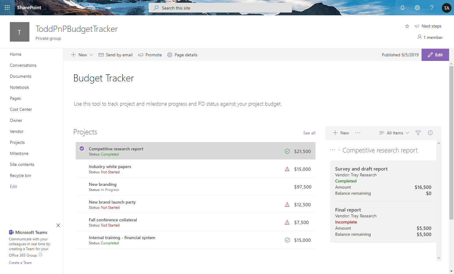
Budget Tracker
The budget tracker sample demonstrates how to use view formatting to format lists and display views of the lists inside connected web parts. This provides the ability to view the budget items associated with individual projects on a single page.
Glossary View Formatters (connected list WebParts)
View formatters to buid a glossary page using connected list WebParts.

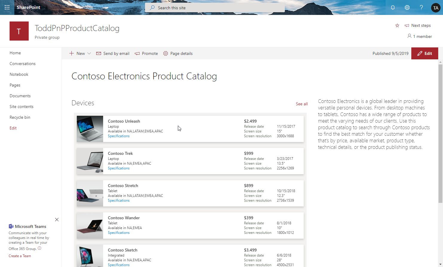
Product Catalog Sample
The product catalog sample demonstrates how to use view formatting to format lists and display views of the lists inside web parts. It also demonstrates how to create links to download documents from SharePoint Document libraries.
Current Year Row Class
Demonstrates applying a class to rows where a value equals the current year. Can easily be updated to compare other portions of the date such as the month, hour, minute etc. by using the other date-part operators.

Custom Header
Sometimes it is necessary to remove the standard headers. In those cases, you may still want to show a custom header. This sample demonstrates creating a custom header and only showing it on the first row. The key to this technique is setting the display style attribute to none (hidden) whenever the @rowIndex is not 0 (first row).

Creating a custom header removes the standard features such as menus, sorting, moving, resizing, etc. In addition, the sticky header feature is now gone. So an additional sample, custom-header-repeating-format.json is provided that demonstrates drawing the custom header every 30 rows.

Custom hover card (View)
A custom card is shown on hover of an item. The hover card shows additional details about an item’s status.

Video Embed Codes
If you upload video files to a SharePoint document library, there currently isn’t a way for an end user to easily get the iFrame embed code for the video file other than using the Microsoft Graph Preview item API. This document library view formatting example composes the iFrame embed code automatically for any video files in the library so users could easily copy and paste it.

Faqs
This sample creates a theme-aware format to use when displaying FAQs (Frequently Asked Questions).

FAQ Accordion
This sample formats your view to appear and work like an Accordion style FAQ (Frequently Asked Questions). This view is responsive.

Testimonials
This is a template for testimonials (Business Statements), it has nice features such as directional messages, styles, utilizes the current theme colours, image persona hover card, overflow logic and even has some SVG Magic! 🙌

Stat Comparison Chart
Format a list view into a chart that shows a comparison between two entities against various attributes. This sample can be used for all sorts of things but is demonstrated below using sports teams as the entities and stats for the teams as individual rows.
These samples are derived from the Butterfly chart format

Person Cards
This sample demonstrates creating a basic person card. You can use this as a quick contact list.

Project Health Dashboard
Template for Project health statuses; features such as Risk scoring, Severity of the project, Schedule timing, Hover effects that provide the latest project updates, Theme Colors, Project Team members, and the cost of the project.

Hover Display

Piano
This sample formats your SharePoint list view to look like a piano.
piano.json
Uses your site’s theme color:

piano-rainbow.json
Uses rainbow colors:

Out of office
This sample shows how to format a list to show upcoming employee time away from office. It features the following:
- Responsive layout through flexbox
- Conditionally showing a today icon if the out of office overlaps the current date
- Conditionally changing the text which shows based on if the out of office start date is the current date
- Use of theme color classes to ensure the format displays as intended regardless of theme (light, dark, custom, etc.)

Multi-Choice Links
Rendering multiple links with a list view format cannot be achieved by using a rich text column. This sample solves that problem (rendering multiple links) using a multi choice column.
This sample is derived from the birthdays sample. This sample shows how to format a list to show sessions associated with a speaker. It features the following:
- Responsive layout through flexbox.
- Shows links to multiple sessions associated with a speaker (The sessions are stored as choices in a multi choice column).
- Use of theme color classes to ensure the format displays as intended regardless of theme (light, dark, custom, etc.)

Multilingual Quotes
This sample demonstrates the use of the @UIlcid token to change the text displayed based on the site display language.

Multi-Person Displays
This sample provides multiple formats illustrating different ways multi-person field display and inline editing can occur. The field is rendered multiple times to show different options.

Likes Count Row Class
This sample demonstrates how to change the background color of a row depending on the number of likes. In this case, the background color of the row changes when the number of likes is 2 or more.

Horse Crests
This sample illustrates some advanced techniques for applying theme colors to SVG elements, box-shadows, and borders. It also demonstrates using custom hover cards on complex elements (elements with children). Details for each technique can be found below.

Honeycomb Links
This sample demonstrates a honeycomb structure of links. The hexagons are displayed using SVG, so that five hexagons are displayed per line. This sample uses the Icons from the Fluent UI. The name of the icon is referenced through an Icon field.

Display a User’s Photo in Group Header
This is a sample of customizing the group header when grouping by user column. Display the user’s picture as well as the user’s name in the group header.

Group Header Status Icon and Color
This is a sample of customizing the group header when grouping by a Status column. This format displays a different color and icon according to the Status.
Also changes labeling according to being only one item or more:
- 1 item is ‘Status’
- X items are ‘Status’
This format only affects the group header, the Assign column in the screenshot above is using out of the box display.
View to get the embed code for a video file
If you upload video files to a SharePoint document library, there currently isn’t a way for an end user to easily get the iFrame embed code for the video file other than using the Microsoft Graph Preview item API. This document library view formatting example composes the iFrame embed code automatically for any video files in the library so users could easily copy and paste it.
Numeric Average Comparison
Provides an example of comparing numeric values across time periods. In this example, we are using grades for students across 4 quarters, though the principle can be applied to any repetitive numeric values.
The View Formatting definition calculates the average of the current and prior quarters numeric grades. The current quarter numeric grade and the average of the previous quarters is displayed. (Example: Quarter 3 calculates the average of quarter 1, 2 & 3)
In addition to the numeric average calculation displayed within each quarter, this example also illustrates how the average value in each quarter can be used to assign additional labels, such as the Student Grade. (Example: A,B,C,D,F)

Modern Event Tiles
This sample demonstrates applying view formatting to an Events list to imitate the modern events webpart. The format is implemented using the Tiles view and there is a format included that only includes this portion to make customization easier (events-tiles-only). The primary sample demonstrates using a single format to provide both a list and tile view as well as demonstrating implementing a custom hover card with default person hover cards as well.

Gallery View:

Link collection using Emojis (🌟 Favorite)
This sample demonstrates a link collection using Emoji and is a customization of the Gallery layout. Additionally, this sample combines group customization with a tile format.

Current User Liked Row Class
This sample demonstrates how to change the background color of a row that has been liked by the current user.

Disable default click action on a tile list view
The sample list of items in a tile view where default click action is disabled. When item is clicked it is selected only.

Disable Selection
This is a very basic sample that disables list item selection within your view.

Chronological Format
This sample formats your view to look like a chronological timeline. This view is responsive.

Butterfly Chart
This sample formats a SharePoint list view into a butterfly chart.

This example shows values from 0 to 500. You can adjust this scale by changing the width value of the style element.
Average Rating Row Class
This sample demonstrates how to change the background color of a row based on Average Rating. In this case, the background color of the row is changed when the Average Rating is 4 or higher.

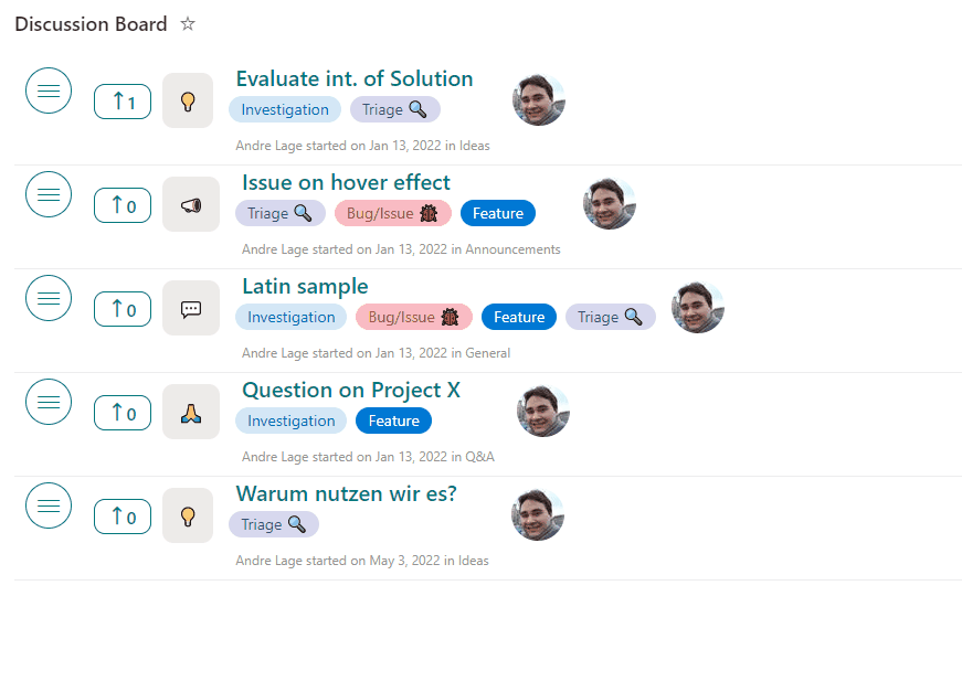
Discussion Board (🌟 Favorite)
This sample transforms your list into a discussion board with title, desription, tags, and votes are available. Additionally, users can react, comment, and perform inline edits!
Timeline Format
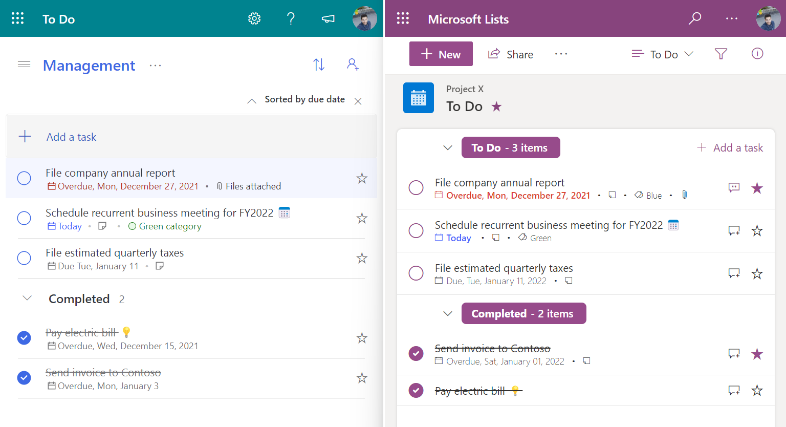
This sample formats your SharePoint list view to look like Microsoft To Do.
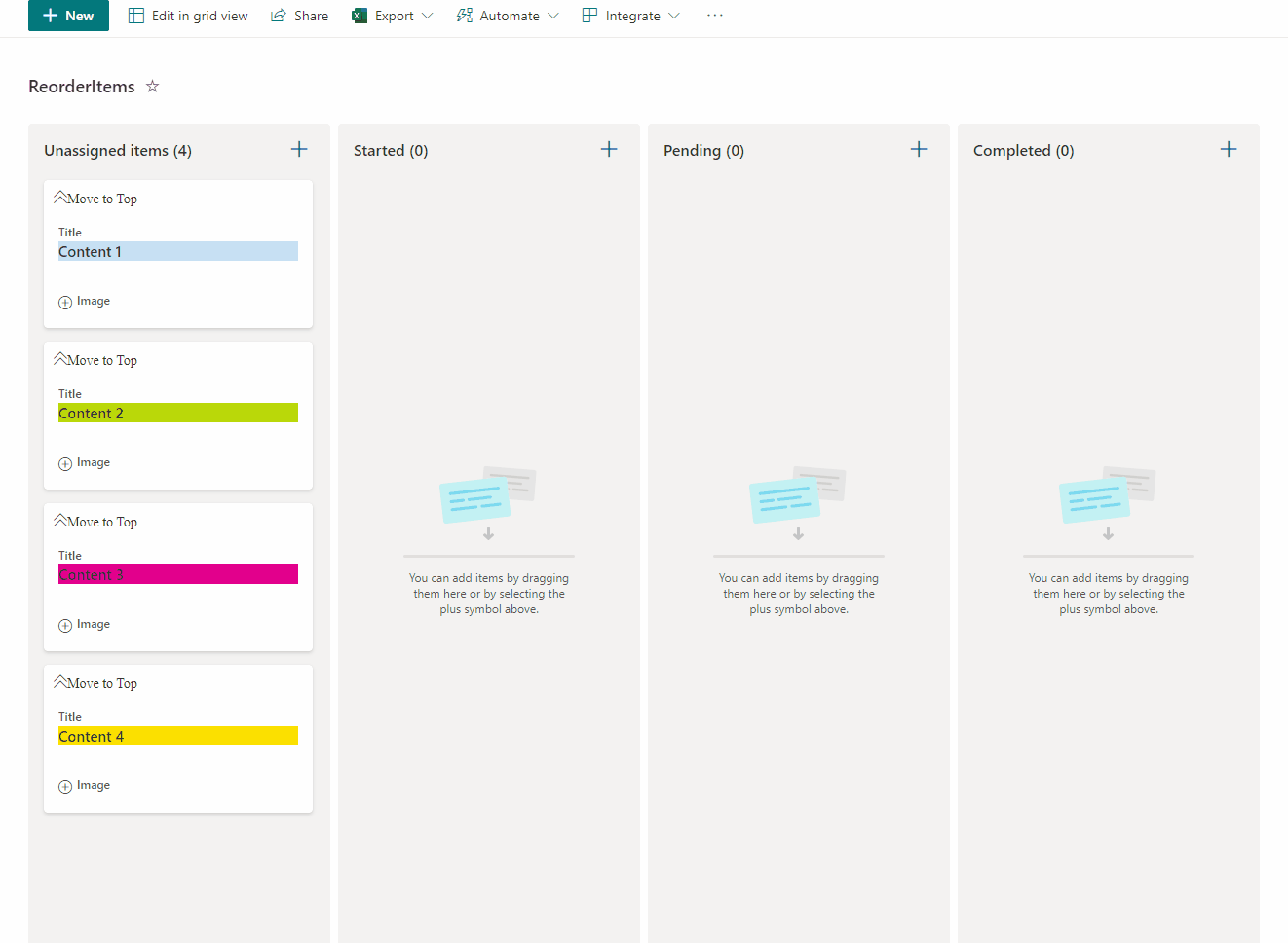
Reorder expand items board format
This sample allow users to manage card order in Board Views and also enables expanding and collapsing images. This sample has the option “Move to Top” that allows users to move cards to the top of the board view as a way to rearrange card positions.
Recent Comments
This sample shows text from the most recent items by showing them in decresing sizes as they get older. This is very helpful for a quick summary view of a list and is great for adding directly to a page.

Random Item
This sample demonstrates utilizing layering to draw all rows on top of each other and then the z-index is set to a randomized value to determine which row to draw on the very top.
The trick is that the z-index is set using the @now parameter with a modulo operator against the total number of items (7). This number should be updated to match the number of items in the list you are trying to display. However, it can also be dynamic by setting this to a relatively high number.

Menu Link Tiles
This sample includes a Metro tiles style menu with additional features such us configuration of tiles using size and color, option to favorite a tile using setValue, and also includes customCardProps to show a custom hover card with the description of a tile.

Menu Link Button
This sample has been inspired by menu-link-tiles by André Lage. It includes a Button style menu similar to Quick Links Button style with additional features such as using width , height, color and fontColor, and also includes customCardProps to show a custom hover card with the description of a tile.

Image Slider
This sample display images as a slider with navigation to the next image.

Highlight rows on current day of the weekHorse Crests
This sample demonstrates formatting items differently based on the current day of the week. As there is no default “WEEKDAY” function in list formatting, we use the date stamp and some math to calculate the day of the week manually.

Heat Map
This sample demonstrates creating a layered dynamic SVG image in a view format. States are highlighted when they have list items that correspond to them. They get darker the more times a state is mentioned.

Theming
This format utilizes theme colors and will adjust correctly as themes change (even dark themes!):

Display User Properties in the Group Header
This is a sample demonstrates the usage of the special string values (User Properties) for a Person field in the group header.
If any property is empty, its respective icon and label are not displayed.

Video Navigator
This sample demonstrates the use of dynamic connections in the list webpart while using a custom format. The format is applied to a list of YouTube videos with each item containing the shortcode for the video. On a page, the list webpart with the custom view is used. The embed webpart is configured to accept it as a connection. This results in a custom video selection application that changes the embeded video on the page.
Gauge Aggregate Footer
This sample shows a gauge in the list footer (when aggregates are enabled).

In Memoriam Tiles
This is a silly sample that shows tombstones for items. It demonstrates custom date formatting, custom tiles (gallery) layout, and safe local image referencing.

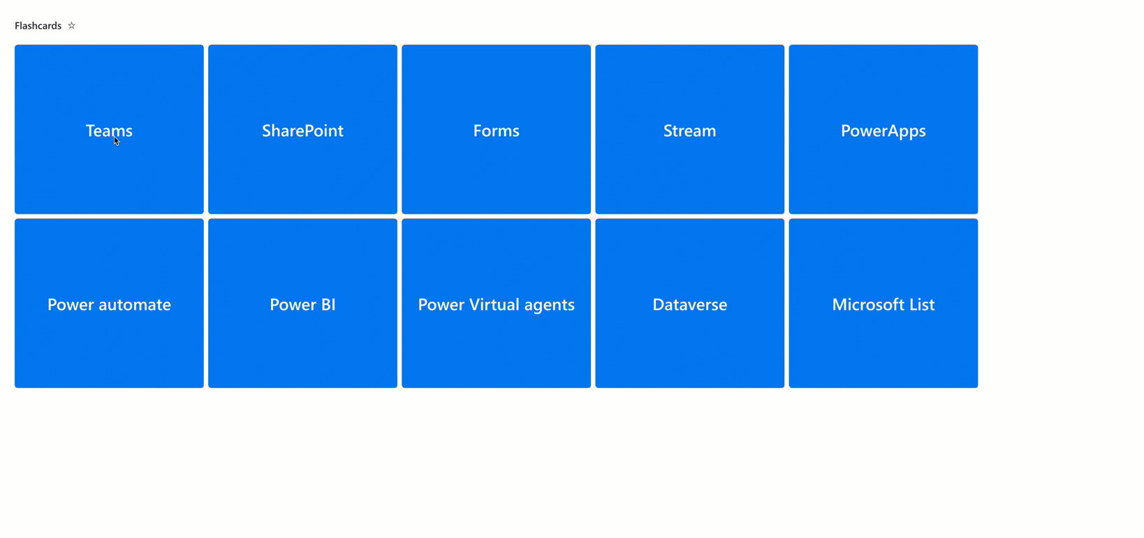
Flashcards
A flashcards view of a SharePoint list. Flashcard is a card bearing information on both sides, which is intended to be used as an aid in memorization. Each flashcard bears a question on one side and an answer on the other. Flashcards are often used to memorize vocabulary, historical dates, formulas or any subject matter that can be learned via a question-and-answer format..
Grouped FAQs (🌟 My favorite)
This sample uses standard group rendering to provide a list of expandable questions. By default, when grouping by a column the column name and the count of grouped items will be included in the group name. This format provides some small tweaks to the group header to only show the value (question in this case). By also hiding the column header and item selection, this format acts like a mini application and could easily be added to a page using the list web part.

Event Registration
This sample provides Event registration with different capabilities such us Start and End dates, Category, Attendees, All Day option, Location, Team URL, and favoriting.

Emoji Reactions
This sample demonstrates reacting with an emoji. Who reacted and the total counts per reaction are stored with the list item.
Two versions are provided. The first, emoji-reactions.json, displays the reactions of the current user and allows them to react. The section, emoji-reactions-count.json, displays reactions from all users and the count of each reaction type.

emoji-reactions-count.json

- Below provides how the counting board is organized by users.
Elf Progress Board
This sample demonstrates:
- Handling Image fields, including providing default display for missing values
- Randomization (random elf quote)
- Multi-level progress bar using images
- inlineEditField
- setValue

Current Year Row Class
Demonstrates applying a class to rows where a value equals the current year. Can easily be updated to compare other portions of the date such as the month, hour, minute etc. by using the other date-part operators.
Internal CV
This tutorial will help you create a basic internal CV through JSON view formatting. Thanks to JSON formatting, it’s possible to create a large custom card to be used as a form itself, by taking advantage of the inline editing feature. Let others know more about you, what you’re good at, and what you’re working on right now. Add projects, skills, and education history to your profile to help others find you when they’re looking for people with a certain expertise.

Content Navigator
This sample demonstrates the use of the id attribute to create linkable anchors. The list is intended to have 2 views (Content and Links) using the 2 view formats supplied. Each view can be added to a page as a separate list webpart. No connections are required. Clicking on an item in the links view webpart will navigate to the item in the content view webpart. Additionally, previous and next buttons are included in the content view for internal navigation.

Hide Automate Button in the CommandBar
The Automate button in the CommandBar provides access to Rules as well as associated Power Automate flows for our list/library. However, there are times when we don’t want the associated flows to be shown because we are providing flow launch buttons. Maybe we’re conditionally picking which flow should run based on properties of an individual item or were customizing the flow run panel and the inclusion of these menu options would undermine that.
This sample only hides the Automate button when an item or items are selected. This ensures the Rules option remains available but prevents users from launching flows for a selected item using this menu.
Below you can see the flows being offered in the Automate menu when an item is selected. With the format applied that Automate menu no longer shows up on item selection:
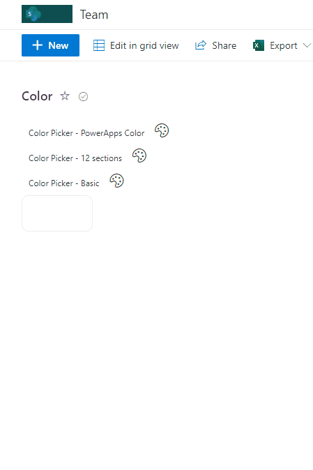
Color Picker
This sample pre defined palettes of colors by Microsoft documentation color enumeration in Power Apps that can be used in solutions as color picker. It’s also include 2 additional colors palettes such us “12 sections” and “Basic” that can be used as color picker.
Hide Automate Button in the CommandBar
The Automate button in the CommandBar provides access to Rules as well as associated Power Automate flows for our list/library. However, there are times when we don’t want the associated flows to be shown because we are providing flow launch buttons. Maybe we’re conditionally picking which flow should run based on properties of an individual item or were customizing the flow run panel and the inclusion of these menu options would undermine that.
This sample only hides the Automate button when an item or items are selected. This ensures the Rules option remains available but prevents users from launching flows for a selected item using this menu.
Below you can see the flows being offered in the Automate menu when an item is selected. With the format applied that Automate menu no longer shows up on item selection:

Remove column name from group header
This view formatting sample can be used to customize the group header to remove column name from group header.

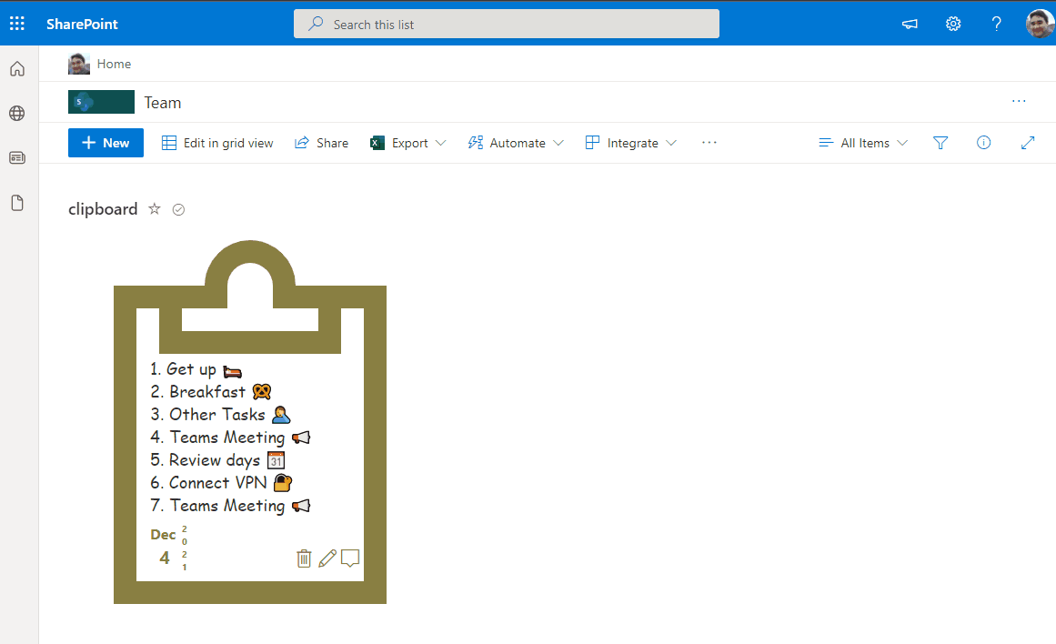
Clipboards
This sample includes format of items to be display as Clipboard, to provide a known user item in a daily usage and improve user acceptance.
Board tags
This sample display formatted card in board that allow tag definition, date of card and menu option to define card position in category, share link and include Flag for focus color on card, associate assigned user, minimize/expand Card and order by top.
This sample displays a formatted card in a board view that enables tagging, updating card dates, menu options to reorder cards within their category, sharing links, flaging (focus colors), assigning a user, and minimizing/expanding the card.

Bar Option Picker
This sample displays a bar with multiple options. When an option on the bar is clicked, the Value column is updated to the corresponding value (0-4) using setValue.
The value is shown in an icon on the left and the progress bar color is based on the value.

Progress color and option appear in Bar and icon appears in left.
Announcements
This sample formats your view to look like a Announcements card with a similiar style to Viva Connection Cards when on a SharePoint Page. In Microsoft Lists it will also show an image that you can connect with the Announcement.
Keyword : Newsletter

Advent Calendar
This sample demonstrates an advent calendar where you can click on the present box of the day to see the presents. The present box cannot be opened if the value in the Date column is later than today.
This sample demonstrates an advent calendar where you can click on the present box of the day to see the presents. The present box cannot be opened if the value in the Date column is later than today.

Travel Requests
This sample formats the SharePoint list template Travel requests.

The approve button will set the value of the Approved column to Yes (true).
Numeric card format
This sample display formatted number column as playing card.

Vertical Mega Menu
This sample demonstrates the use of multi lines of text column value and the split operator to display a vertical mega menu.

Whiteboard sticky notes
This sample creates a whiteboard-styled sticky notes that displays information. The sticky notes have two sides, so when clicked they show another piece of information.

Team Poll
This sample combines a couple of lists and a few formats to demonstrate creating an application using view formatting. The end result is a configurable poll that end users can submit their choices too and view grouped results.
An optional Power Automate flow is also presented below to ensure that as Team Members are added to the Office 365 Group a response list item is configured automatically for them.

Student & Class Learning Tracker
This sample transforms your list into a learning tracker which enables teachers to

Staff Rota Shifts with CSS Table
Summary
This sample demonstrates creating a Rota Shifts table using CSS Table layout by using rowFormatter to customise the entire display of a row. The aim is to demonstrate the following concepts:

Links to Search Page
This sample demonstrates displaying links to the search page. When you open the search page, it displays the search results where the query registered in the Query column of the item has been executed. Also, there are two types of links, each with a different search scope. One is for the entire tenant, and the other is for within the site.

Image Grid
Displays images in a grid layout with customisable height and width. The sample was inspired by the chevron-shape-format by André Lage. On click of each post, the link specified by the URL is opened. On hover on each image the description of the image is shown. Optionally an icon is displayed on the top right of the image.

Group Header color change depending on amount of items grouped
This is a sample of customizing the group header by showing a color code that changes depending on the amount of items in the group:
- Less then 5 items shows the header as red, yellow, etc
- Exactly 5 items shows the header as green

Exam Bundle Tracker
Often in certain schools, a system of corporate marking exists where multiple teachers teaching a particular cohort (e.g. Mathematics Extension 1) will mark a section of each student’s paper to ensure consistency.
When this occurs, often bundles of papers are divided by class, and each teacher takes a bundle out of a cupboard, but it can be hard to track:
- Who has possession of a particular bundle
- Whether I have marked a particular bundle or not (without having to hunt down and check through every bundle!)
This sample transforms your list into an Exam Bundle Tracker which answers the two questions above.

Custom Chart
Thanks to JSON formatting, this templates package will allow you to quickly create 6 different types of charts, which you can organize into collections, share, and publish on SharePoint pages. Microsoft 365 offers many options and ways to share and publish information in the form of charts. In particular, people involved in internal communications have now an extra tool available: Microsoft Lists charts.

Overdue Row Class
This sample applies a class to any row where the DueDate column is overdue (earlier than @now).

Wrap up
The official source is github.
What have you used for so far ?
Jeff, Jeff, Jeff,Jeff, Jeff – oh my goodness! What fabulous information and I’ve already used some of these codes. But — all I want to do is be able to have alternate rows shaded with colors of my choosing — only one color per list but I can’t seem to find something so simple anywhere!!! Are you able to help? Thanks so much! I’ve already placed this article where I can read it since it has some great info!
Hi, sorry for the unacceptable delay, i missed this one !
Unfortunately I havent played a lot with this feature ! Do let me know if you figured out something.
I suggest you post on the associated github https://github.com/SharePoint/sp-dev-list-formatting/issues 🙂
Have fun !
Hello Jeff, Great article and thanks for posting. I am a JSON newbie and currently teaching myself. Do you have any examples like this….. I am trying to output a product catalog list into two column output. In each column, simply include a title, description, and “more” button. Thanks in advance! Rod
Thanks for this great collection!
You’re welcome !
Does View Formatting works in SharePoint 2019 on-premises? I don’t see option for that in the list.
hi, no it is only for SharePoint Online in Office 365, at the moment. Maybe in a future feature pack for SharePoint 2019.
I don’t see this option on my On-Premises SharePoint 2019 site. Looks like this is misleading.
Yeah looks like it. Some mvp confirmed my thought it’s not existing. Only column formatting. But not every formatting are supported
Even Column formatting is limited. It does not support Excel like formulas. 🙁
Looks like the article is updated and SharePoint Server 2019 is removed from it. 🙂 Thanks for your help.
Hi sorry for the late reply, have you found what you were looking for ? Otherwise i suggest to create an issue in github
My question was whether SharePoint 2019 supports view formatting, but seems it does not.
Is it possible to access the items from another lists ? To build Parent Child relation in the view.
Hi, as i am aware no. You may use PowerApps or SPFX to achieve your requirement
Thanks, how to use the ‘Location’ Column in JSON, for example I have column “Event Location” with “Location” Data Type. I wants to use the City “Event Location: City” in the view.
It didn’t work when used “txtContent”: “[$EventLocation:City]”.
Hi Jeff. Thanks a lot for the info. Wanted to ask if we can covert one of the column to hyperlink to display all the items in the row (url as ……DispForm.aspx?ID=….). Something of the sort of (linked to item) in sharepoint on premise
Hi! Where can I find information on the view formatting that is displayed in your Article Image (selling items with an image of the item, button for Contact Seller, etc.)? I cannot seem to guess the correct name of the Format, nor find any info on that look online, so any help would be greatly appreciated! Thank you so much!
Hi, i think it was just a sample … no code available sorry, but you can start from an existing one and customize from that if you have some development skill
Hi there. I’m using sharepoint online with moder page.
I’m trying to apply rows conditional formatting based on a Status column value. However, in the rules this column do not appear, i think it’s because a lookup value. I tryed advanced mode and write my own json code but i can’t make it display anything… it seems it’s invalid. A litle example:
{
“additionalRowClass”: {
“operator”: “:”,
“operands”: [
{
“operator”: “==”,
“operands”: [
{
“operator”: “toLowerCase”,
“operands”: [
“[$Status]”
]
},
{
“operator”: “toLowerCase”,
“operands”: [
“Closed”
]
}
]
},
“sp-css-backgroundColor-successBackground50”,
“sp-css-backgroundColor-neutralBackground”
]
}
}
It’s not possible to do formatting based on lookup values?